Transforming Top of the Slope’s Digital Presence: A Case Study
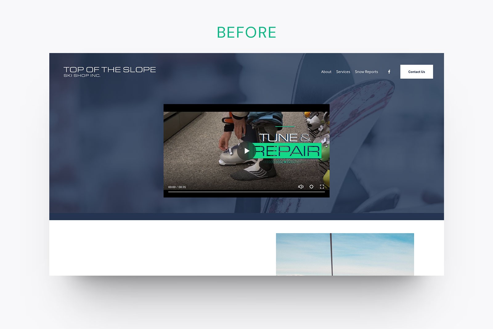
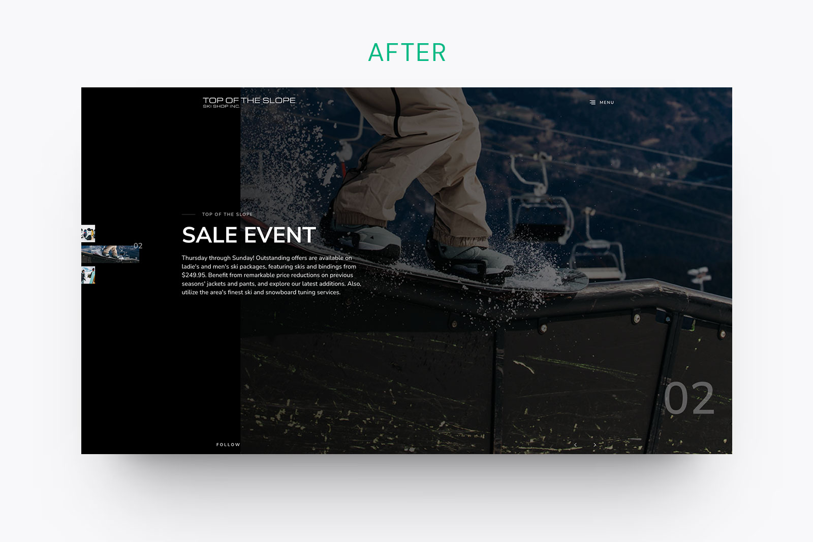
We helped Top of the Slope Ski Shop in Wilkes-Barre, PA, transform their outdated website into a streamlined, user-friendly platform using zero-code tools, saving over $10k in development costs. With a clean, accessible design, simplified navigation, and a scalable system, their site is now ready for future growth and full ecommerce functionality.
Read Time
10min
Category
Web Design
Top of the Slope Ski Shop in Wilkes-Barre, PA, is a go-to for skiing and snowboarding enthusiasts looking for the best gear. From brands like Burton, Patagonia, and The North Face to Atomic skis, the shop offers high-quality products that customers love. But their old website didn’t reflect the energy and quality of the shop. Customers found it hard to navigate, and the online experience was falling short of expectations. The Shed came in to help re-imagine the website, creating a user-friendly experience that made it easier for customers to browse, inquire, and stay engaged.
We approached the project in phases, knowing that small businesses like Top of the Slope often need a roadmap to reach their full potential. Phase 1 involved launching a quick site holder to establish an immediate online presence. Phases 2 and 3 will focus on refining their branding and identity, and ultimately integrating full eCommerce functionality. Every marathon starts with a step, and we’re here to help businesses take it.
A Design That’s Ready to Shred


Top of the Slope’s old website was cluttered and disorganized, making it hard for users to find what they needed. The branding wasn’t aligned with the shop’s adventurous, high-quality image, and the user interface wasn’t intuitive. Our goal was to fix those issues and create a website that didn’t just look better, but worked better.
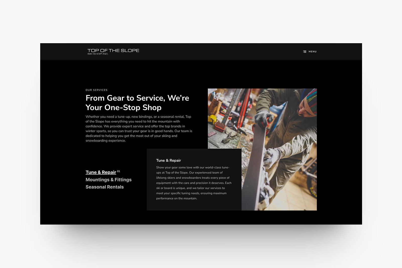
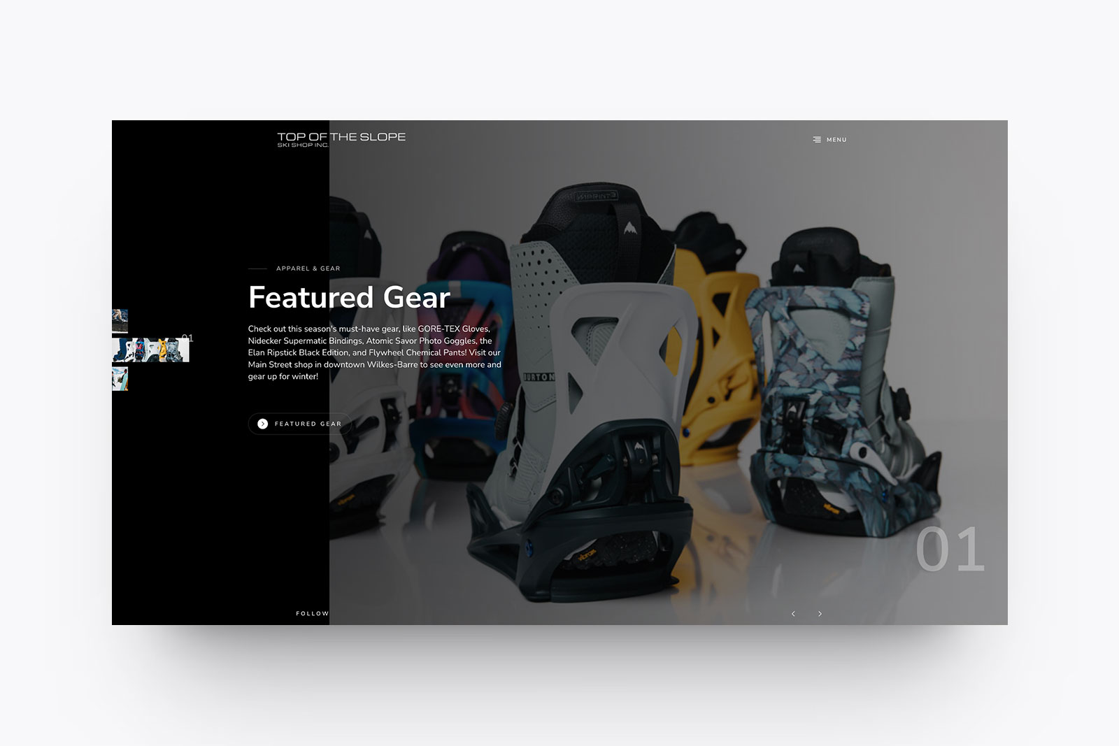
We started by simplifying everything. The new site has a clean design that’s easy to navigate. High-quality product images now stand out, and bold, clear typography guides users where they need to go. Users can now access important information with fewer clicks, whether they’re browsing gear, checking out rentals, or learning about the brands. The new design highlights the shop’s premium offerings while embracing the spirit of adventure that defines Top of the Slope.
Less Clicking, More Action

The old site was full of unnecessary steps that made simple tasks harder than they should be. We eliminated those obstacles and reduced the number of clicks needed to complete key actions. Users now get from the homepage to product or brand pages quickly, and it’s easier than ever to start a rental or inquiry.
This streamlined workflow ensures that customers spend less time searching and more time engaging with what matters—whether that’s shopping for gear or exploring the shop’s brand offerings. The result? A smoother, faster experience that makes customers happy and keeps them coming back.
Accessibility for All Users
Accessibility was a key focus throughout the redesign. The old website wasn’t accommodating users with disabilities, which meant that some potential customers were being left out. We fixed that by making the site fully responsive across all devices and ensuring it was optimized for screen readers and keyboard navigation. High-contrast text, clear alt descriptions for images, and simple, intuitive navigation make the site accessible for everyone.
Now, users with different needs and abilities can navigate the site easily, whether they’re on a desktop, tablet, or mobile device.
Heuristics That Work
In the old design, inconsistent navigation and poor user feedback caused confusion. We solved that by creating a clear, user-friendly navigation system and building feedback loops into key actions like adding items to a cart or confirming a rental.
Error prevention was another critical improvement. In the past, if users made a mistake, like selecting the wrong product, there wasn’t a simple way to correct it. Now, they can make adjustments quickly and continue without losing progress. With added elements like breadcrumbs and well-defined sections, users always know where they are on the site and how to get back.
Metrics That Show Progress
Before the redesign, many users were abandoning the site due to its complexity. Since the launch of the new design, we’ve seen marked improvements in user engagement. Customers are staying longer on product pages, interacting with featured gear, and spending more time browsing brands.
Our time-to-value metric has improved as well—users are now finding what they need 30% faster than before. By simplifying navigation and clearly displaying key actions, we’ve increased both user satisfaction and conversions.
From Concept to Launch
We used Figma as our primary design tool, keeping the process collaborative and seamless between our team and the client. By working within Figma, we ensured smooth transitions from concept to final design, allowing for real-time feedback and minimizing any miscommunication. When it came to building the site, we leveraged zero-code tools to avoid the need for traditional developers, which saved Top of the Slope over $10,000 in development costs. This not only streamlined the launch process but also kept the project within the client’s budget, delivering a high-quality product without the overhead of heavy development.
We also focused on building a robust design system to ensure consistency across every page. This included establishing a flexible color palette, typography guidelines, and reusable UI components. This system allows for future updates to be made easily while maintaining brand integrity.
During testing, we focused on how users interacted with the new navigation and layout. The results were clear—users found what they were looking for more quickly, and our heatmaps showed high engagement in areas like “Shop by Brand.” These insights helped us further optimize the site to meet customer expectations.
What Users and Stakeholders Are Saying
Michael Miscavage, owner of Top of the Slope, was thrilled with the new site’s performance.
“The new website is exactly what we needed. It’s professional, clean, and makes it much easier for our customers to find what they’re looking for. The increased engagement is already noticeable, and I’m excited for what’s next.”
Customers, too, have noticed the improvements, with feedback emphasizing how much easier it is to browse gear, check availability, and explore the shop’s wide range of brands. The smoother navigation and better layout haven’t just made the site more appealing—they’ve made it more functional.
Planning for the Future
As we move into Phase 2, we’ll focus on refining Top of the Slope’s branding and identity, capturing the shop’s unique vibe and aligning it with a strong visual direction. Phase 3 will introduce full eCommerce functionality, allowing customers to purchase gear and apparel directly from the site. This will be a game-changer for Top of the Slope, extending their reach far beyond their local market.
The best part? The design system we’ve built is ready to grow with the business. Whether they’re expanding their product offerings, adding new services, or launching a new campaign, the site is designed to scale seamlessly with their ambitions.
Every Marathon Starts with a Step
At The Shed, we understand that small businesses don’t always have the budget to tackle everything at once. That’s why we take a phased approach to ensure they get the results they need without overwhelming their resources. Top of the Slope is a perfect example of how a strong roadmap can turn into long-term success. With Phase 1 complete, they’ve taken the first step, and we’re excited to continue guiding them as they build a digital presence that matches the quality of their brand.
If your business needs a partner to help map out the path to success, we’re here to help. Let’s get started.

Jaime Nash
Founder | Studio Director
With almost 2 decades in the creative industry, I help small businesses and start-ups tell their stories through impactful design. As founder of The Shed Creative, I’m all about creating memorable, results-driven experiences—simple, strategic, and always human.


